
As technology evolves, so do user expectations. In 2026, we are see...


Right mobile form layout can make an awesome end result. The 5 most used mobile shape design standards and examples will assist you in user experience and winning marketplace.
Nowadays, people are mobile friendly and use mobile apps not for entertainment but for day to day tasks also. Mobile forms establish interaction step with the user and mobile applications. Mobile forms help in getting data from a user including registration, subscription, user feedback, questionnaire forms, purchase, sales transactions and so on. An effective form design can help not only to improve their user experience in but bring better conversion rate and better marketing results.
Every mobile form layout has a specific purpose, either to attract registration, close deal, get contact details. Poorly designed forms or even unsuitable designs may cause the lack of user interest or transaction disasters. Therefore, we need to recognize the basic standards of shape layout, to keep away from the errors in mobile form designs.
Here are different examples to design a perfect mobile form for your app or website.
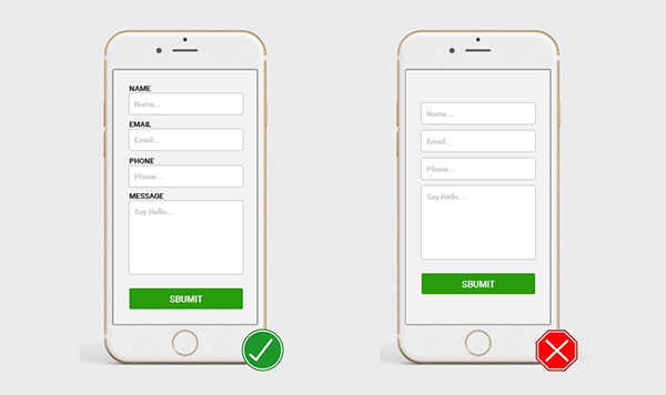
Clear and minimal forms are the language of communication with the user. Like a speech in the auditorium, a form should communicate with the user in a logical manner.
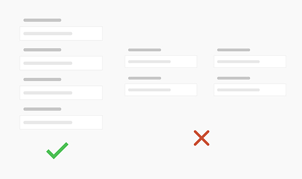
Multi-Column forms can effortlessly be ignored by users and cannot be filled out. The single-form design gives complete direction and more effective in terms of ROI.
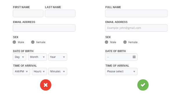
Keep the form design short and simple as possible. Longer form generate complexity in design, people like things that are easily understood. Complex form resist user's to complete it especially in small screens. Minimize the input fields to make your forms load faster and smoother to filled.
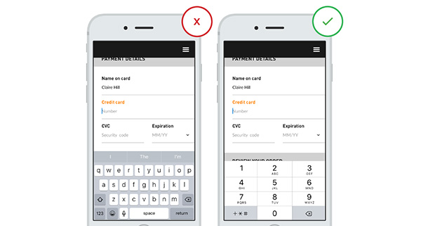
It's recommended to offer specific keyboards, such as while input account, password, fill inside the mailbox, enter the nickname, and so on.. That will reduce input mistakes and help users to quickly fill the entire form.
Creative Head

As technology evolves, so do user expectations. In 2026, we are see...

In today's digital age, your website is often the first interac...

In the dynamic world...

In t...

In the dynamic landscape of online conten...
In the world of web and app de...

